The Aesthetics of Art Toys: Design Language Analysis
Art toys represent a unique intersection of fine art, product design, and pop culture. Understanding the aesthetic principles that define the medium reveals why certain figures achieve iconic status while others are forgotten. This analysis examines the design language of contemporary art toys.
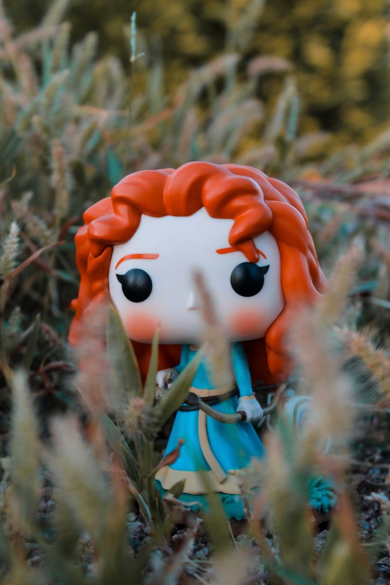
Proportion as Emotional Signal
The proportions of an art toy figure communicate emotional information before the viewer consciously processes the design. Enlarged heads and eyes trigger nurturing responses, making figures feel approachable and collectible. Elongated limbs suggest elegance and sophistication. Distorted proportions create unease or intrigue. BaiChaoHui‘s Zombie Party characters use proportion strategically — Lokiki’s oversized eyes create immediate emotional connection, while the slightly elongated undead features add narrative complexity.
The most successful art toy proportions balance familiarity with novelty. Too conventional, and the figure fails to stand out. Too alien, and it loses emotional accessibility. The Zombie Party aesthetic achieves this balance by starting with cute proportions and subverting them with horror elements.
Color Theory in Art Toy Design
Color choices in art toys serve both aesthetic and narrative functions. Pastel palettes signal approachability and comfort, making them ideal for entry-level collectibles. Bold, saturated colors communicate energy and desirability. Muted or monochromatic palettes suggest sophistication and exclusivity. BaiChaoHui uses color strategically across Zombie Party variants — standard editions feature accessible palettes, while hidden editions use metallic and glow-in-the-dark finishes to signal rarity and narrative significance.
Surface Treatment as Storytelling
The surface quality of an art toy — matte, glossy, textured, transparent — contributes to its narrative impact. Matte finishes feel artisanal and grounded. Glossy finishes feel playful and commercial. Textured surfaces add tactile engagement. Transparent elements reveal internal structure, suggesting depth and complexity. In Zombie Party designs, the combination of smooth character surfaces with textured “undead” details creates visual and tactile contrast that reinforces the cute-meets-creepy aesthetic.